Financial Review Apps
Android
iOS
Financial Review Apps Android iOS
01
Project Overview
The Financial Review is the daily habit of successful people — no matter where they are.
When it comes to time-sensitive work and personal investments, the flexibility to seamlessly browse, consume and reference articles anywhere, anytime becomes fundamental. From those at the start of their career to others at the top of the corporate ladder, Financial Review readers are proven power strivers who need confidence in products that will keep them ahead of the curve.
(Details)
Type
Native Apps
Brand
Australian Financial Review
Company
Nine Entertainment Co.
Category
News Publishing
Role
Lead Android Designer

02
Challenge
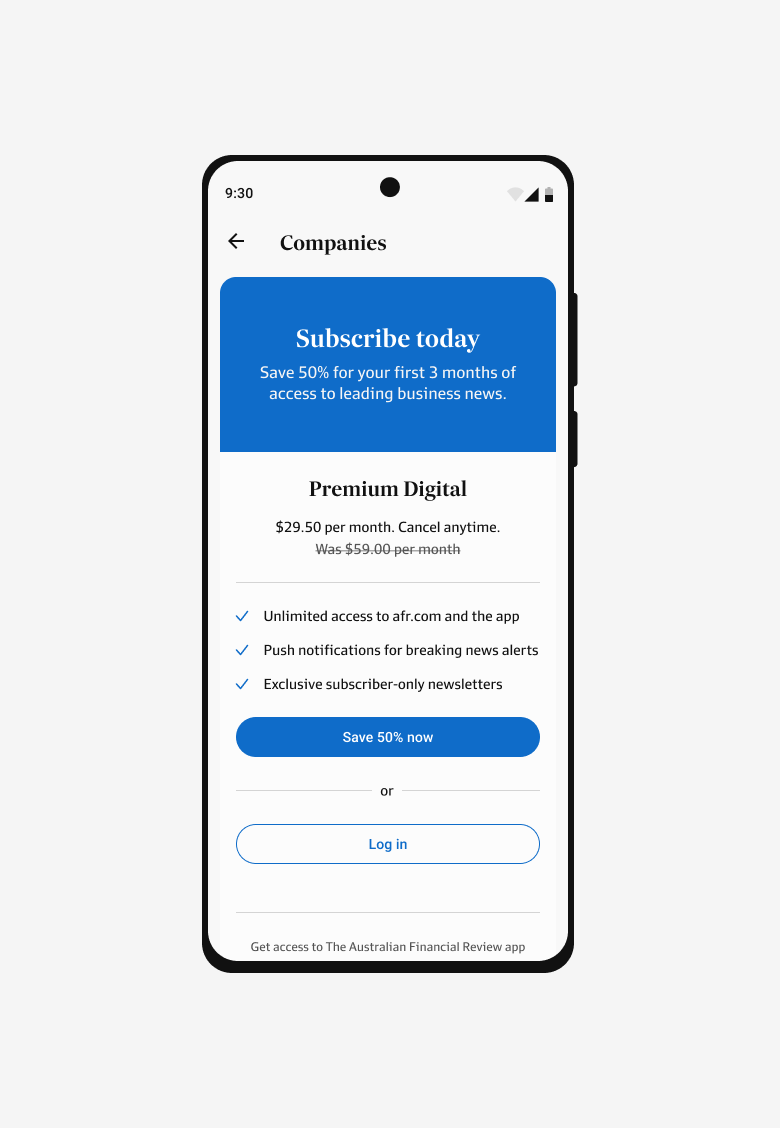
Put Australia’s leading business and finance publication into the pockets of readers.
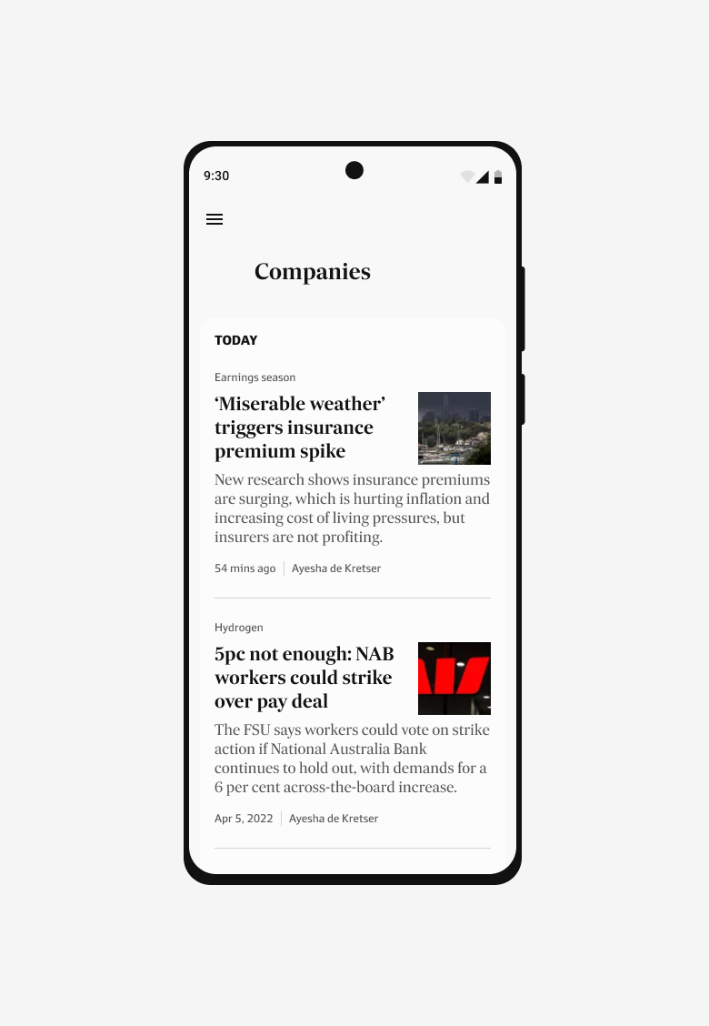
With the reality of a digital first world, the iOS app was an outdated product with a fragmented experience highlighted by the newly updated website. The Android app? No where to be seen — a consistent top 3 product pain point across the board in site satisfaction and churn surveys. To a newsroom who metaphorically considered the newspaper a mansion and the digital products a ‘shack in the back’, the Financial Review apps were never a priority.

03
Development Strategy
A holistic strategy built for a bigger picture.
By taking a future focused approach, the goal was to avoid creating any issues that would hinder growth over time. Without a predecessor for Android, we focused on going to market first, and quickly, ensuring the retention of subscribers accessing mobile web content on Android devices. For iOS that meant focusing on minimal disruption to the existing users including seamless transition journeys onto the new platform and launching with at least feature parity.
Both apps implemented a native first approach to design patterns and components — staying true to brand and tone of voice. Meeting commercial requirements by aligning ad configurations agnostic with web for ease of inventory management.
04
Research
/ Need fundamentals
How do we fit into a reader’s repertoire of tools?
We needed to take a fresh look at our audience needs and current behaviours in an app context. Working with research, we dissected our audience across devices and operating systems, then utilised exploratory qualitative surveys and diary studies to gain insight into usage, attitudes and propensity to use apps. This helped define who we were designing for, how a future app fit into a their repertoire, and the functionality needed to be successful.
Six key insights came to light:
Design an app experience that caters to planned and spontaneous moments — across fast, medium and slow news needs.
01
Consider cadence of news
Digital news should feel as accessible and convenient as Instagram or Spotify. Readers want quick and easy access that isn’t just another mobile web experience.
02
Quick, easy, relevant
Cognitive overload creates stressful moments. Needing ways to access and navigate to things quickly with the option to follow up to read later.
03
Avoid cognitive overload
Readers expect the experience to feel personal. Readers are looking for a ‘Newsfeed’ solution, and expect elements of an anticipatory design approach that builds and learns with them as they go.
04
Personalisation is expected
We are only as our good as our last experience. There is a small window to build habit and ongoing retention with our readers. Showcasing the value an app can provide beyond the web experience.
05
Make (and leave) a good impression
Users don’t know what they don’t know. We need to assist readers through contextual onboarding — showing them the breadth and depth of our features, and how best to engage for their needs.
06
Onboard
05
Principles
Differentiations that make native apps habitual.
Collaborating with product leads, developers and designers, workshops were undertaken to holistically reflect on the values our audience resonate with. Creating a sub-set of principles that would guide the upcoming work within the Financial Review app space, providing a sounding board for design decisions.
We formulated these principles by focusing on three exercises: key word brainstorm, mind mapping and principle formulation. Noting down what values the app should embody. Expanding on what was meant, creating phrases that describe our principles. Then wordsmithing on repeat until refined and aligned amongst stakeholders.
These principles are intended to be ever evolving as we continue to learn more about our audience. They were crafted to be reflected upon alongside the existing brand principles, focusing on what differentiates a mobile web experience to a native one.

We design the app to work hand in hand with the web experience, recognising they are not the same.
Seamless over consistent

We use motion to reduce friction by drawing invisible connections, adding moments of delight where it makes sense.
Guide through motion

We provide opportunities to make the app personal and serve the individual needs of each reader.
Made for you
06
Research
/ Navigational patterns
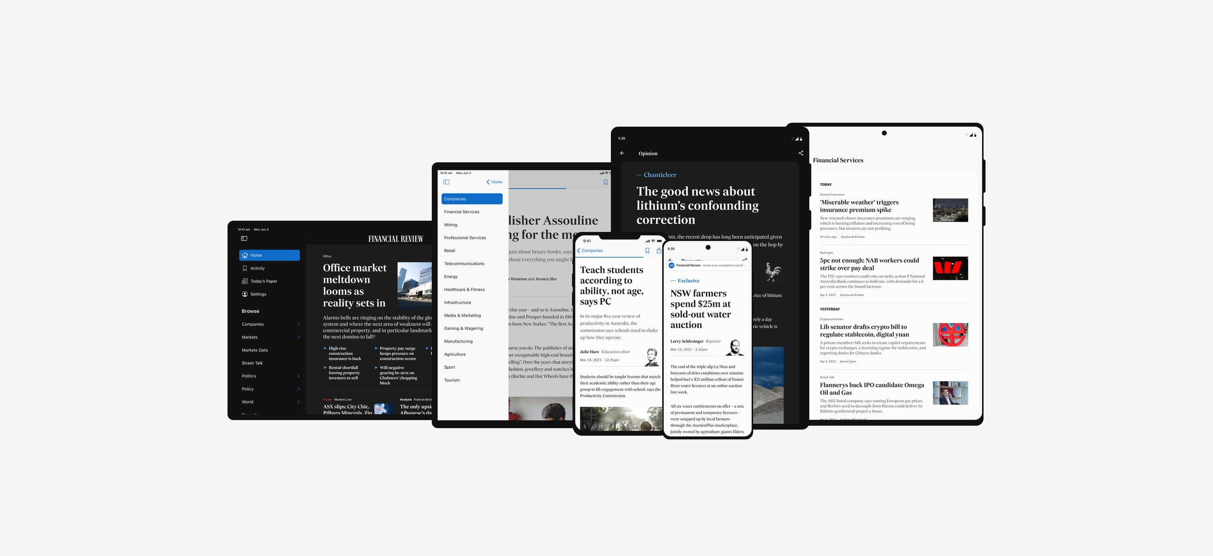
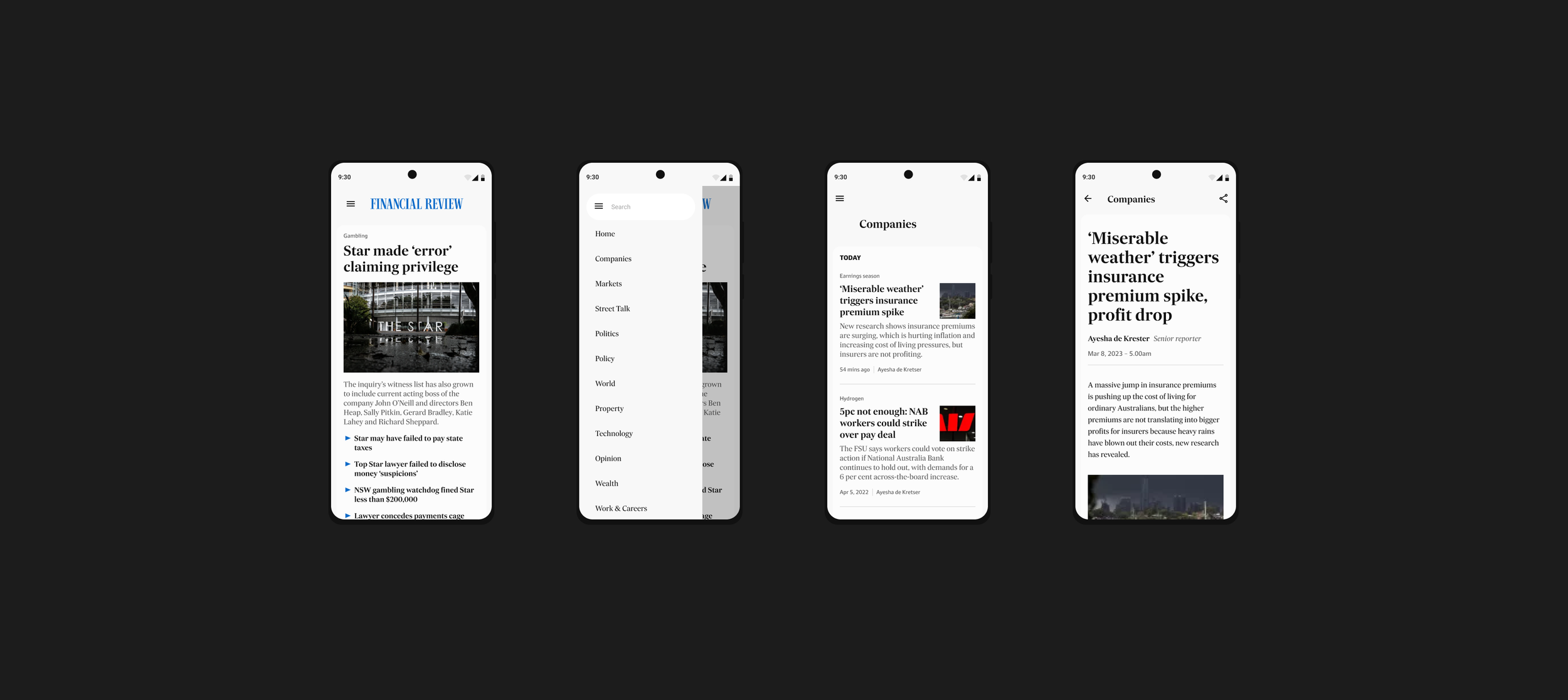
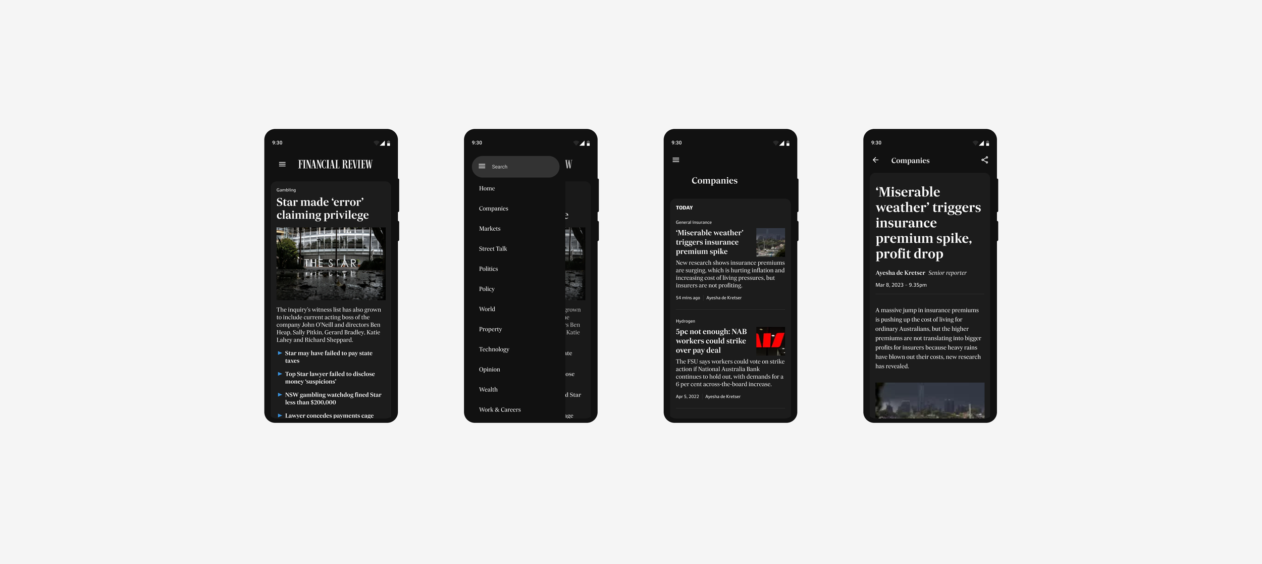
Learnt behaviours become second nature.
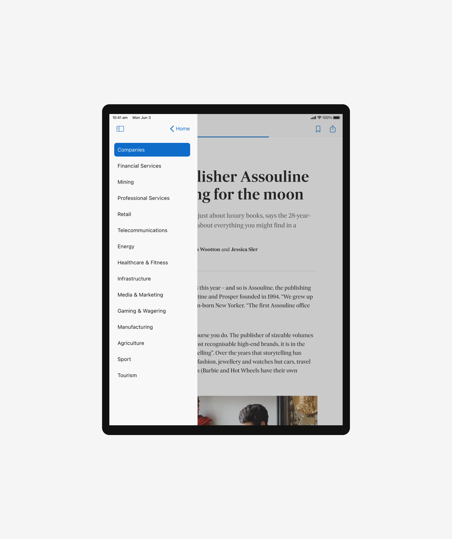
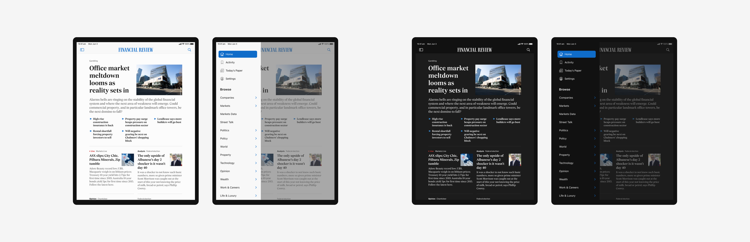
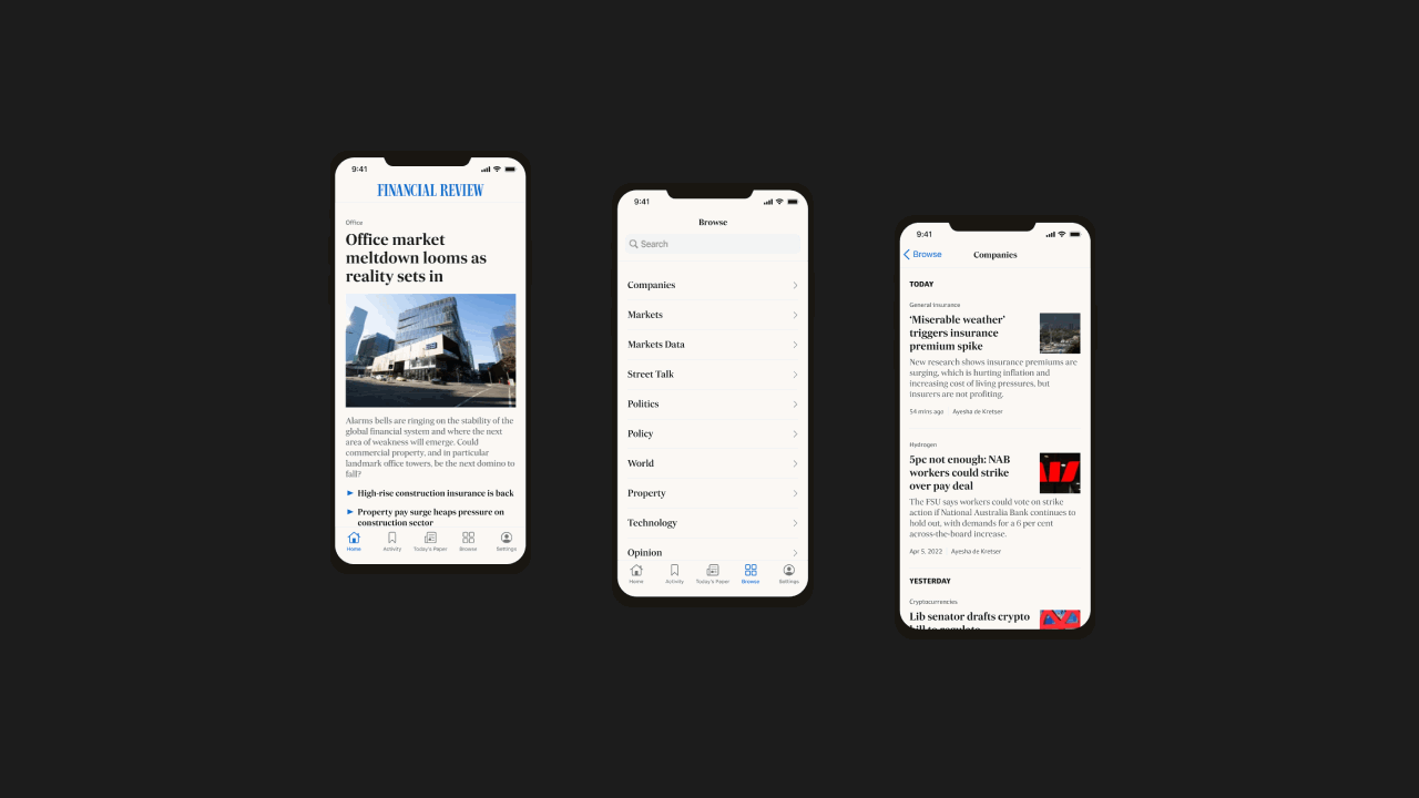
The navigation is arguably the most important feature to get right. Whilst iOS and Android offer the same breadth and depth of content, each operating system has its own native patterns which are ingrained into a users natural learnt behaviour. To create intuitive apps, we needed to be conscious and cater for these differences — making the experience fit seamlessly into the natural habits of our readers, while simplifying development through the use of existing library components.
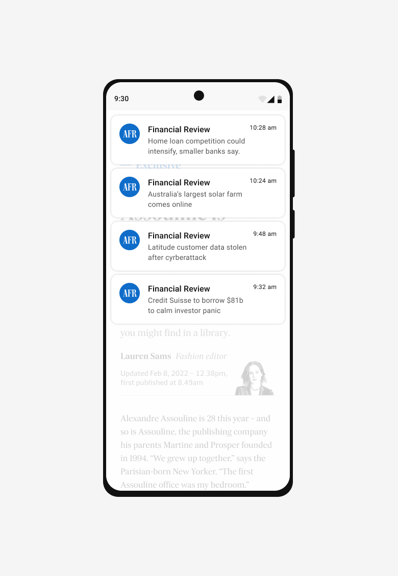
With proven navigational patterns in our toolkit, we undertook a combination of exploratory and task-based usability testing. The objective was to understand whether the proposed feature set were understood and met expectations, as well as to observe how readers way find to content and features. Clear overarching insights were learned:
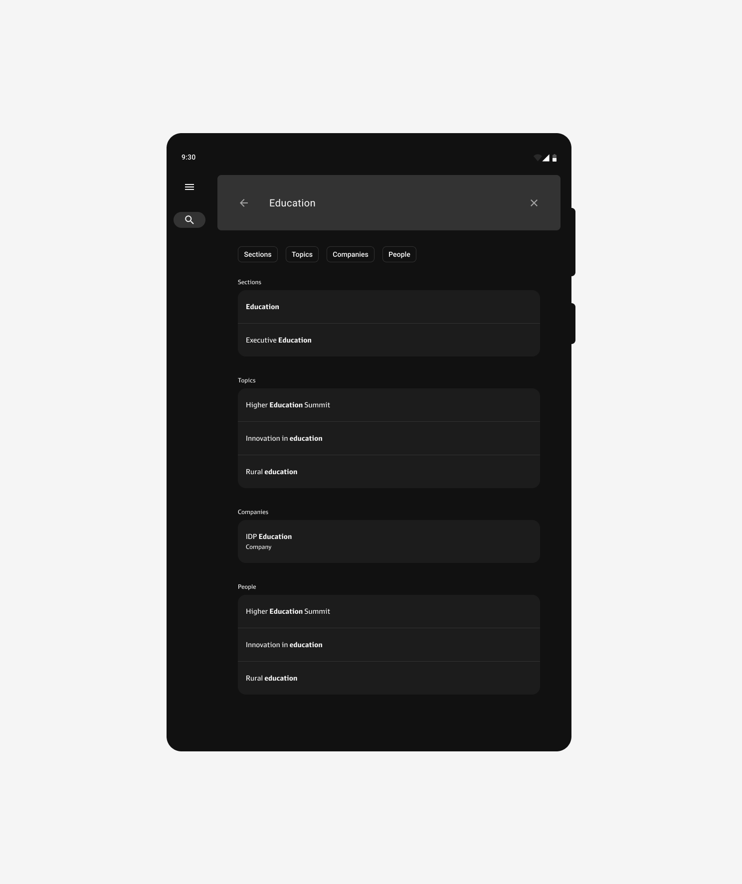
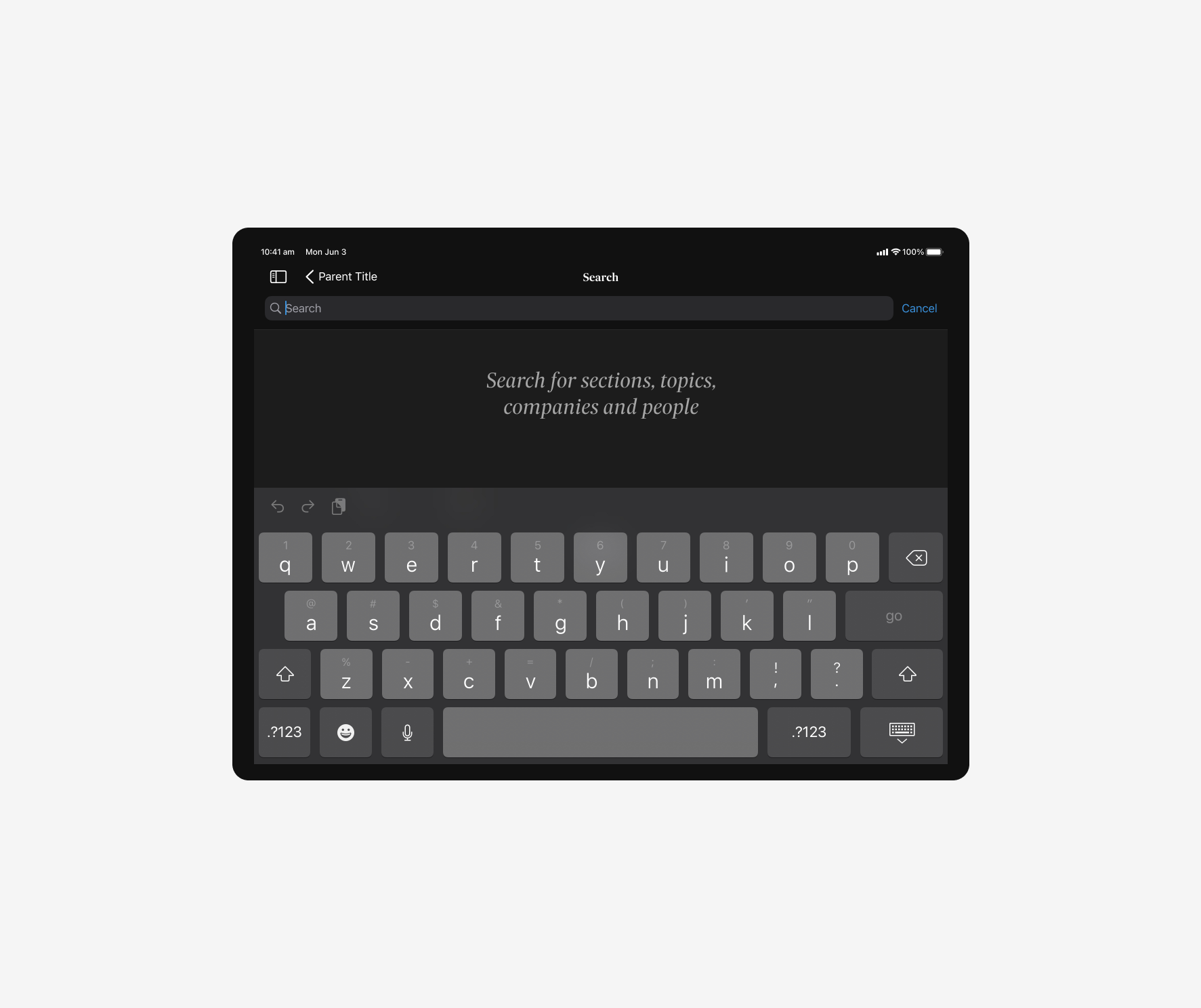
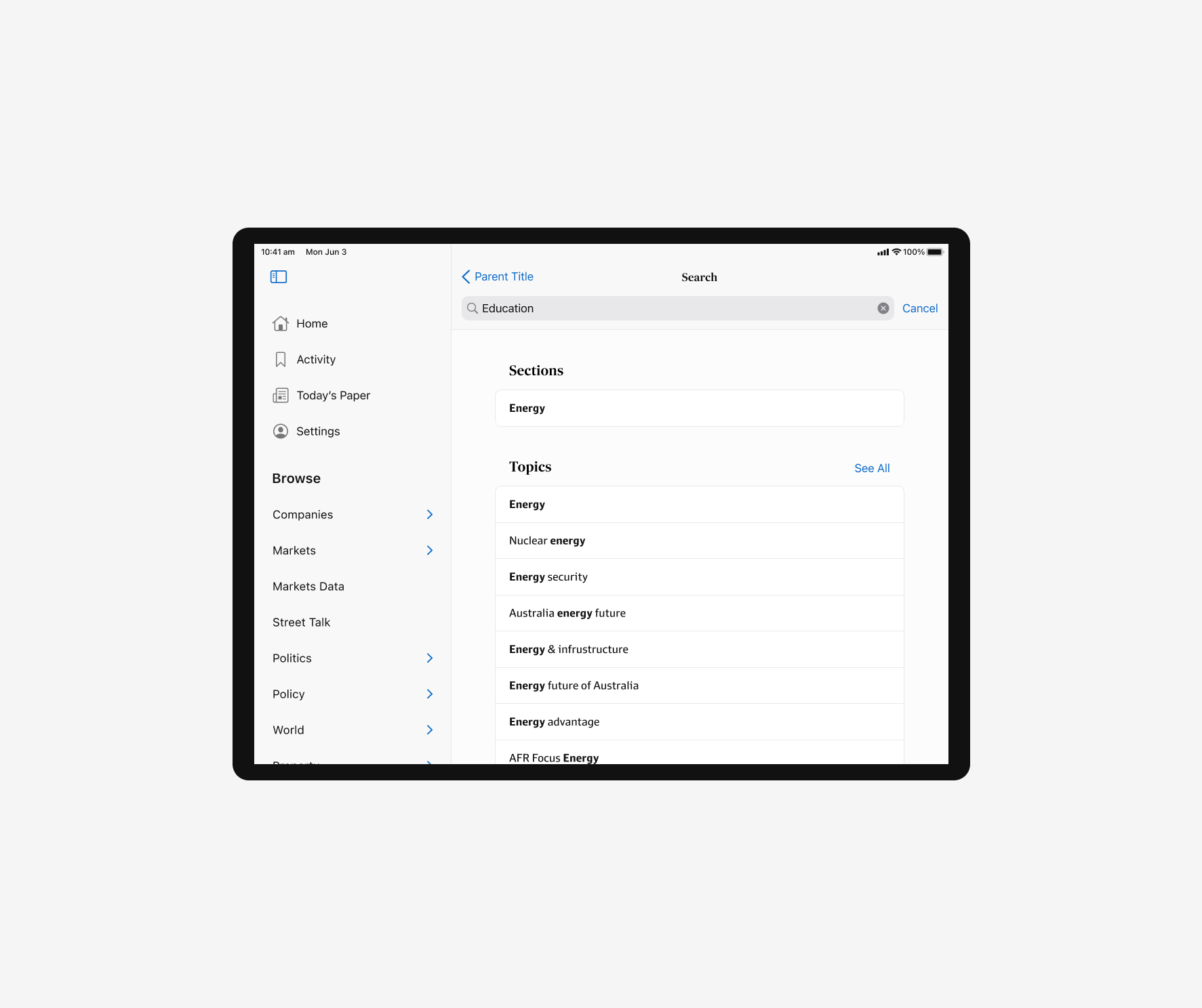
Readers expect to get to where they want within one to two clicks. They aren’t looking to browse as deeply as if they were browsing on web — it is a seemingly more personal experience. However it was not about cutting down access to our depth of content, more so simplifying wayfinding through tools like search.
01
One to two taps away
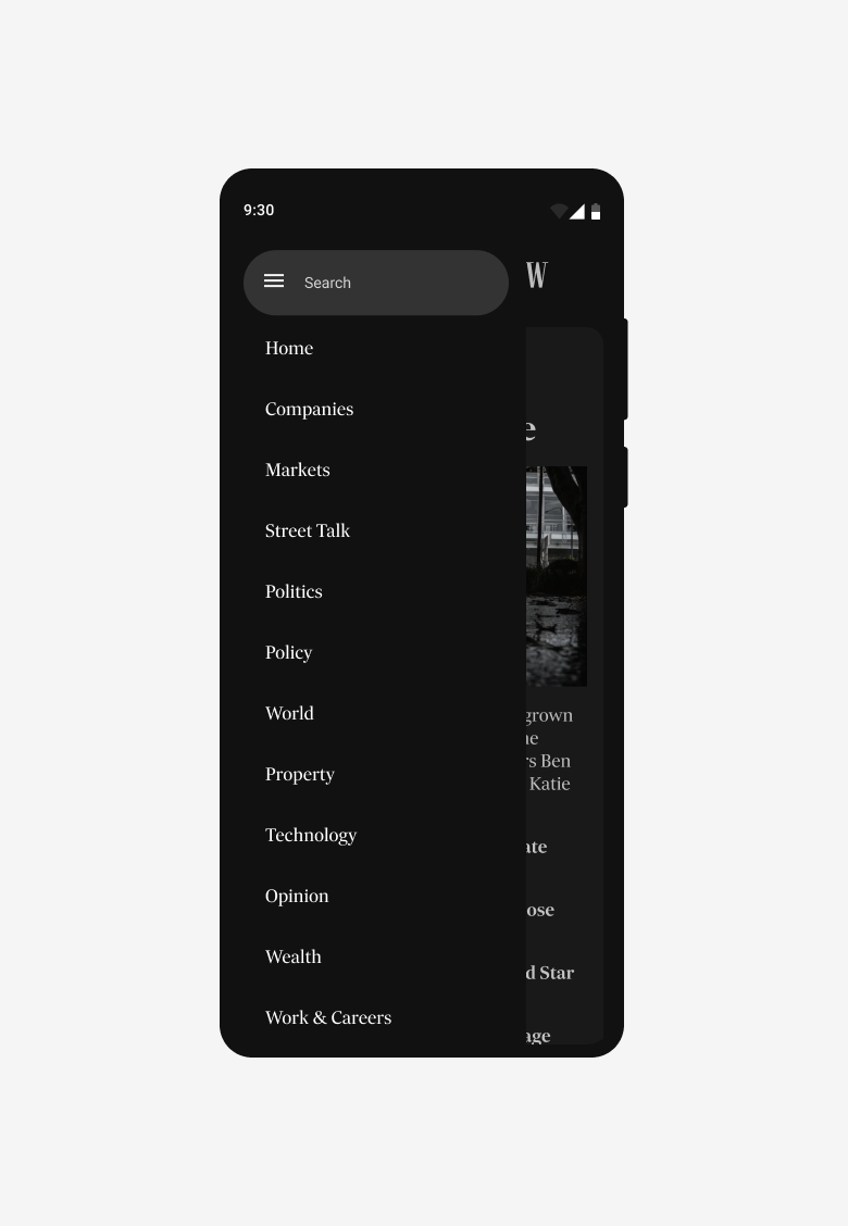
Readers don’t know the information architecture as well as we think they do. Many participants naturally scroll through the homepage to browse for sections — where most failed the task of finding specific sub-sections. Long lists made it overwhelming and difficult to find what they are after quickly.
Unfamiliarity in content categorisation
02
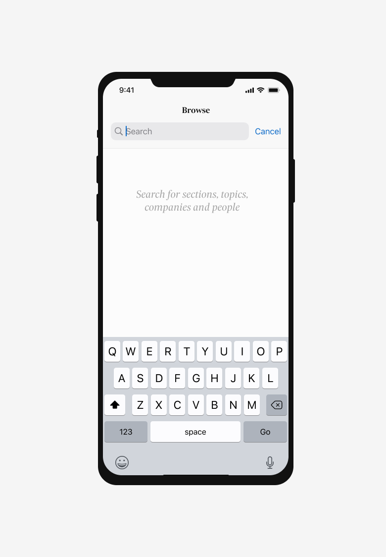
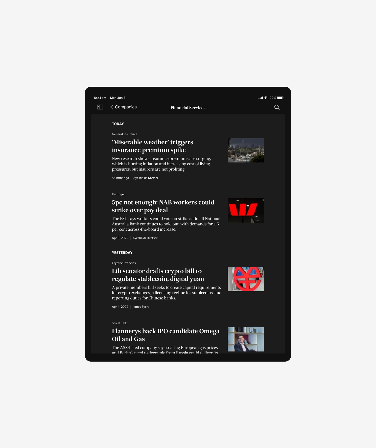
Readers come to see the latest and stay across the surface of the reporting landscape. Then, turning to search when looking for more granular information within their interests and industry.
Homepage for latest, search for specifics
03

06
Production
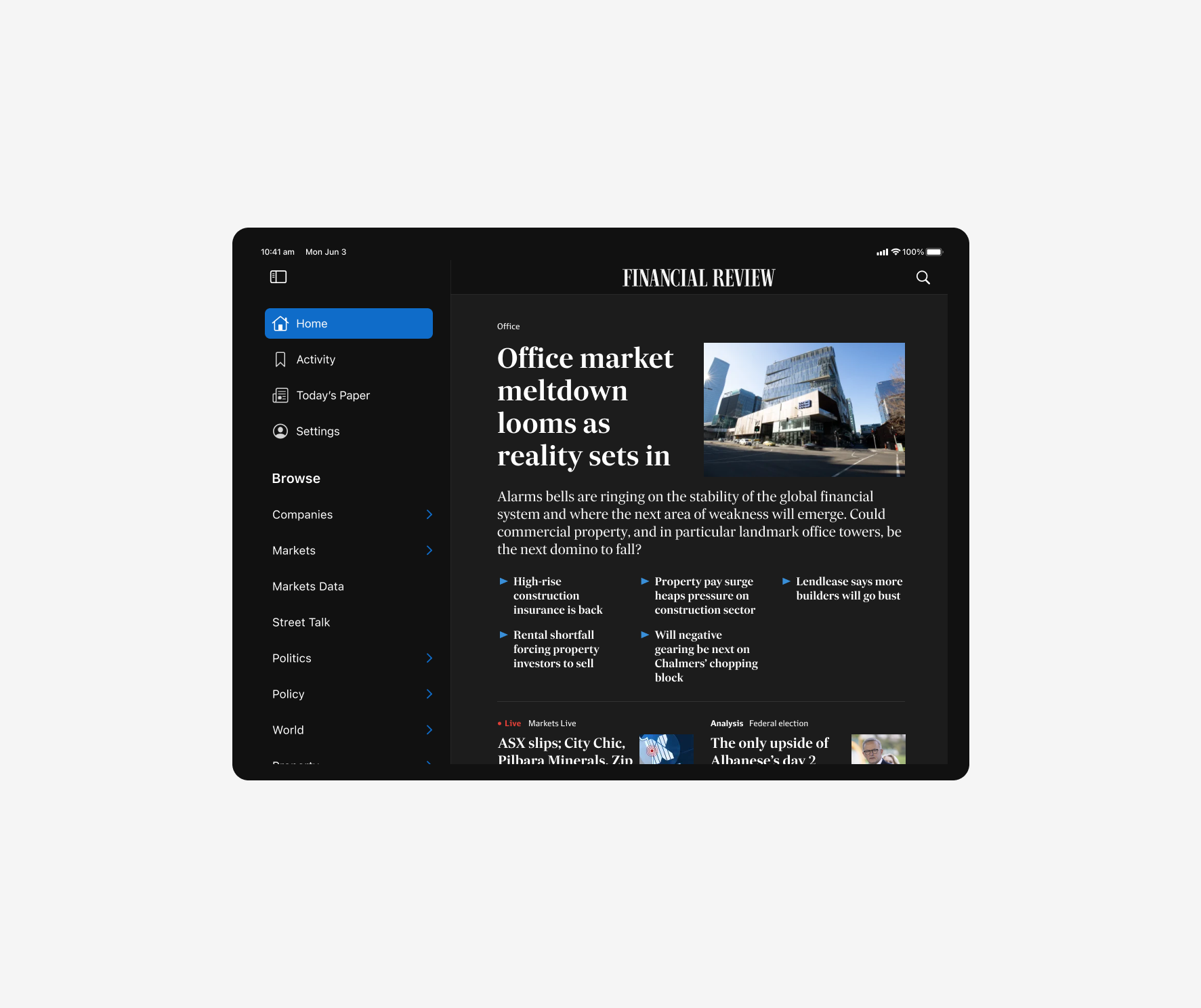
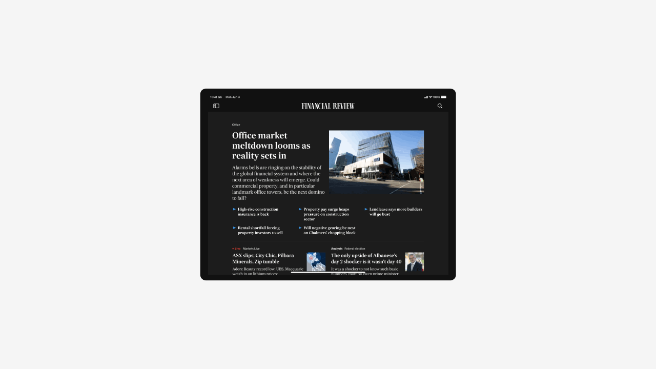
An evolved visual identity.
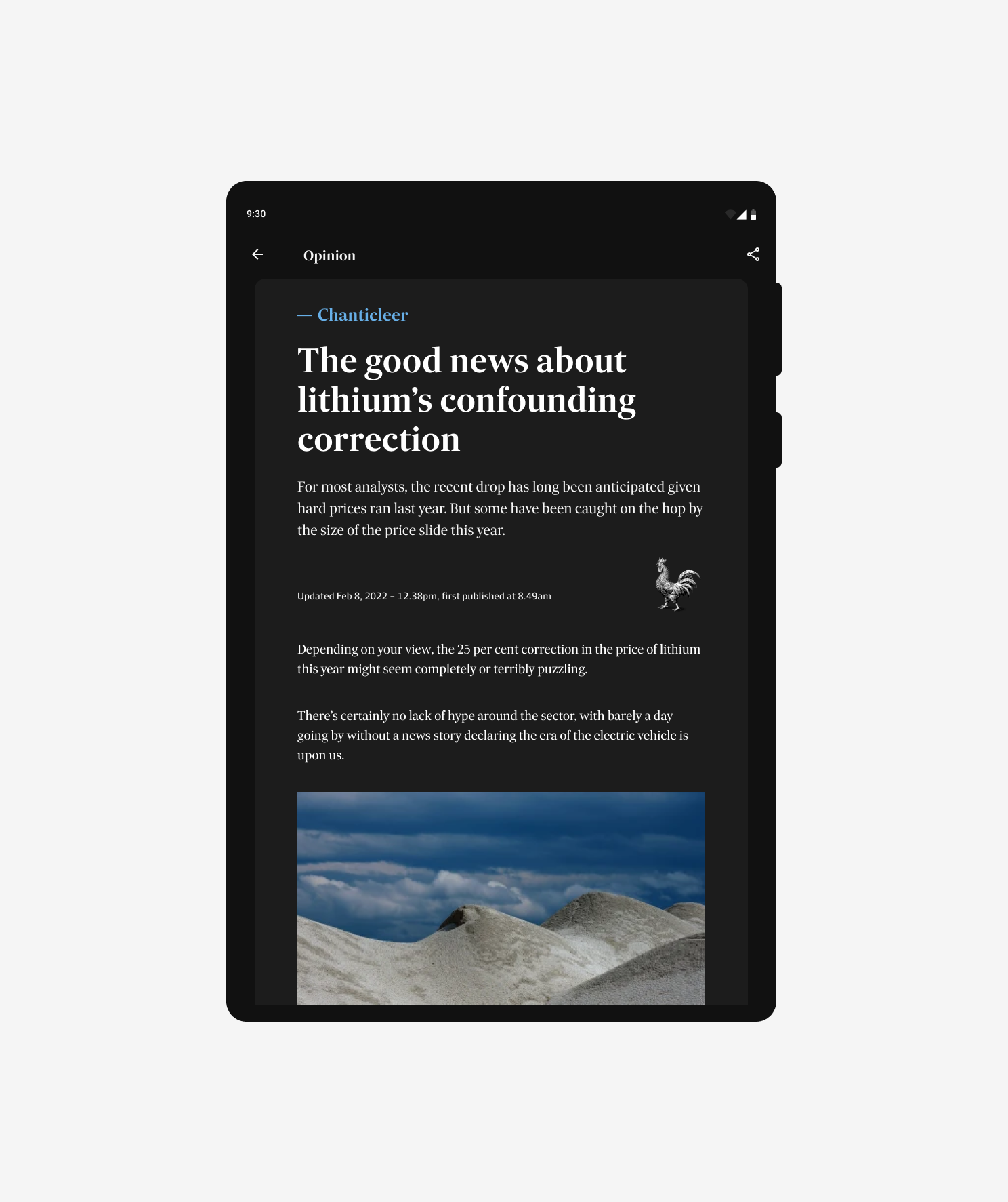
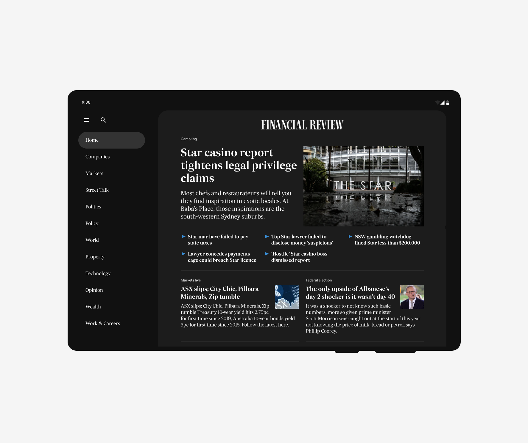
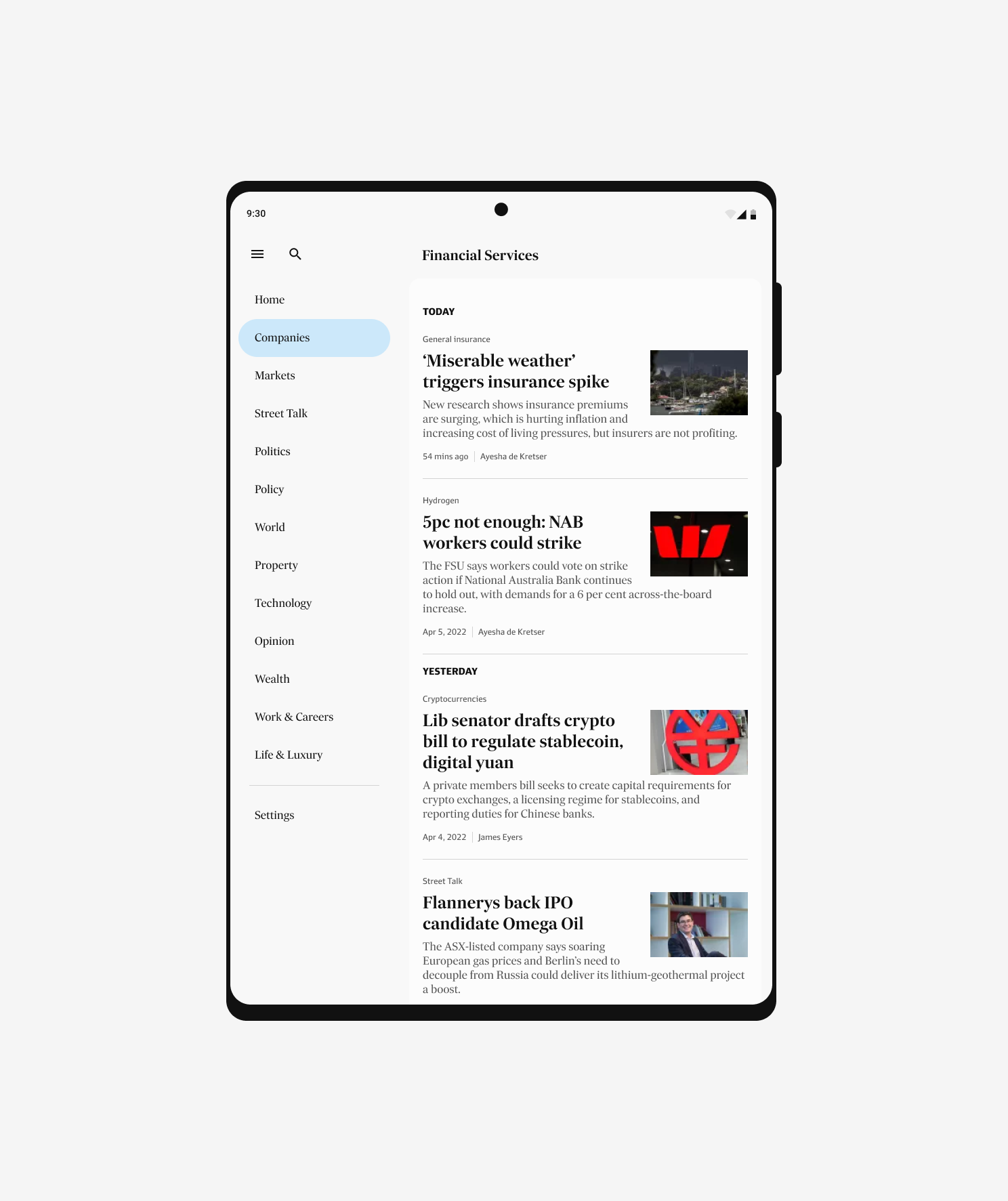
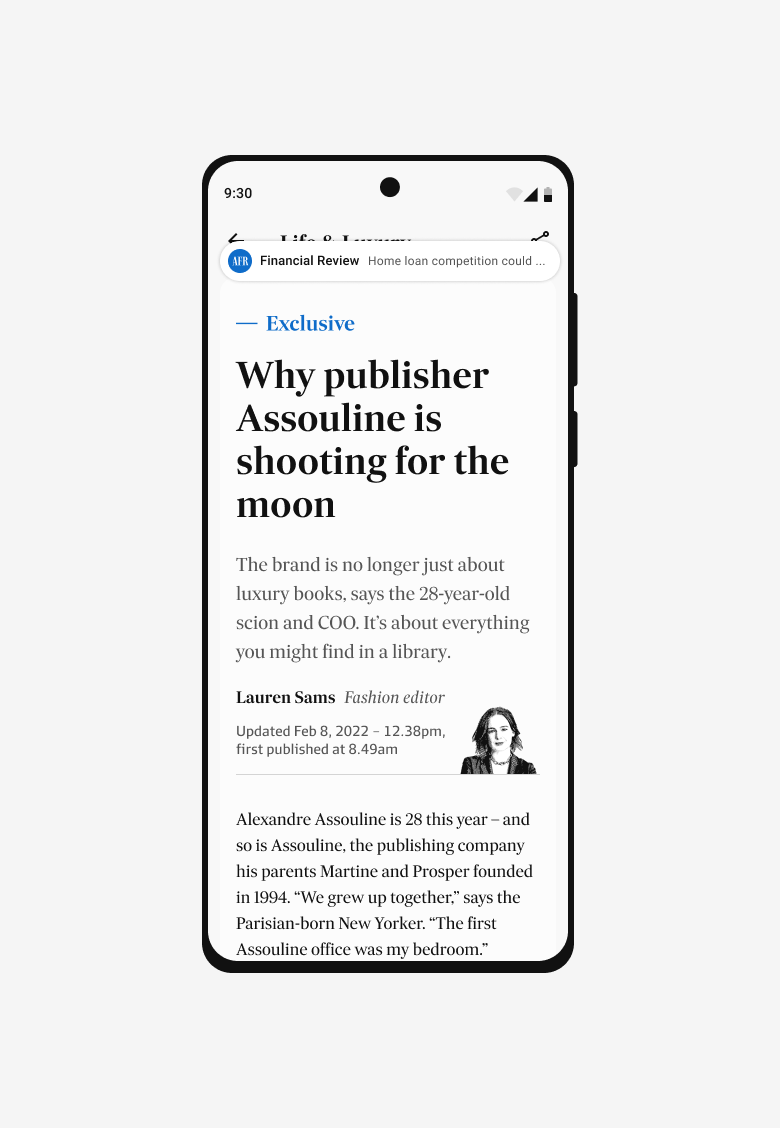
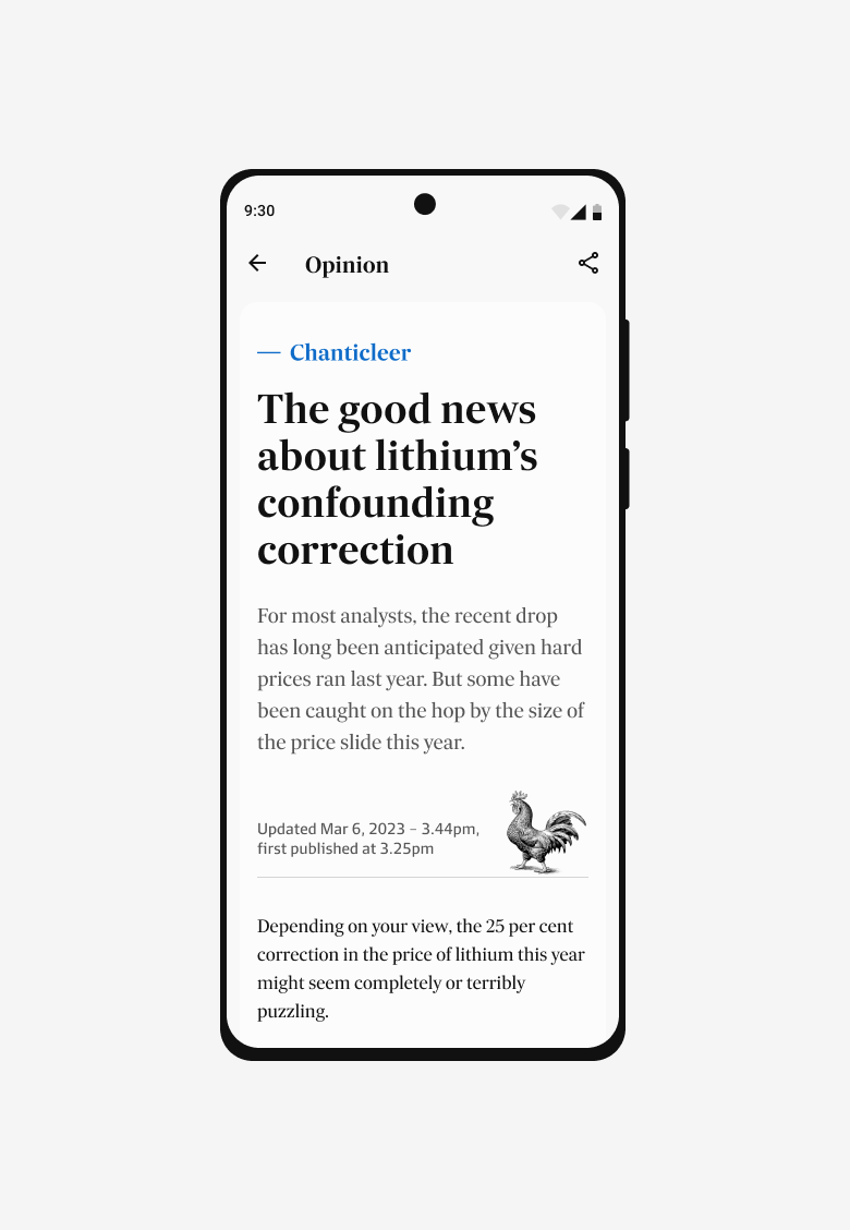
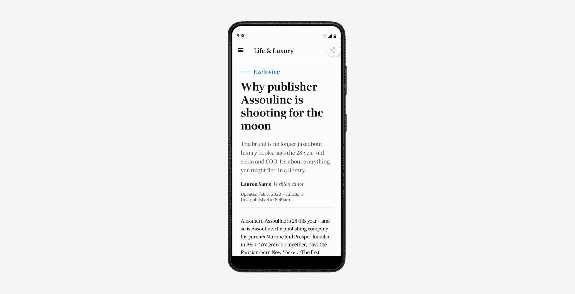
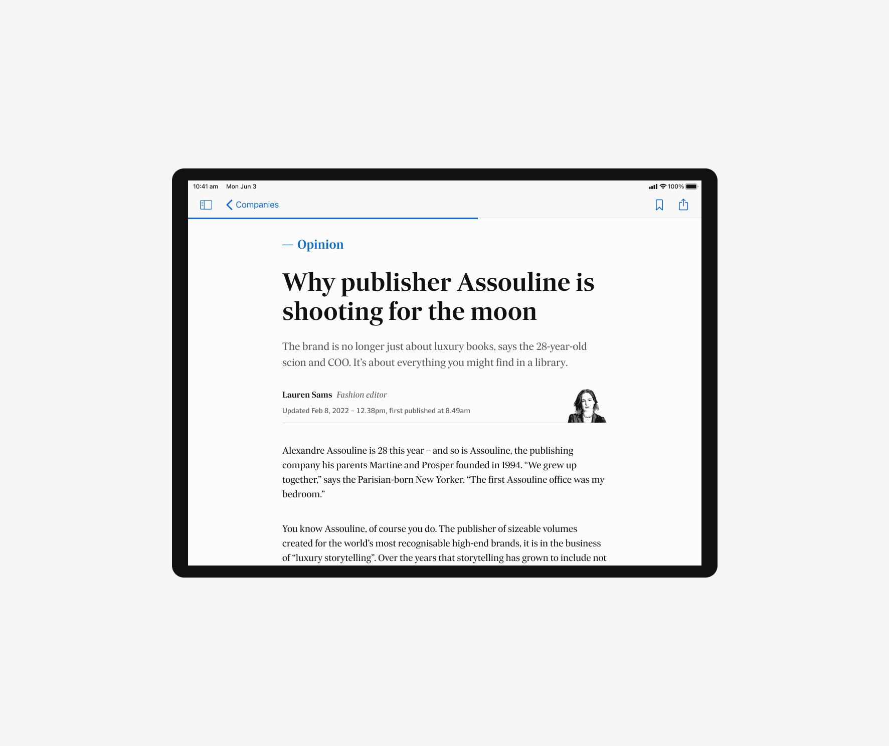
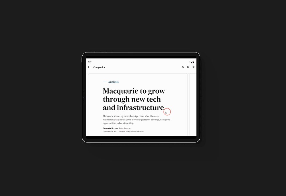
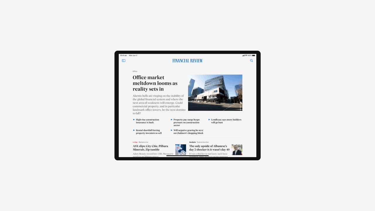
We took the opportunity to push the needle and embrace native first design, evolving the Financial Review’s visual language in an app context. Leaning on material design and human interface guidelines, we further elevated the reading experience by:
Being generous with breathing room to pay consideration to proximity to screen and satisfy large touch targets.
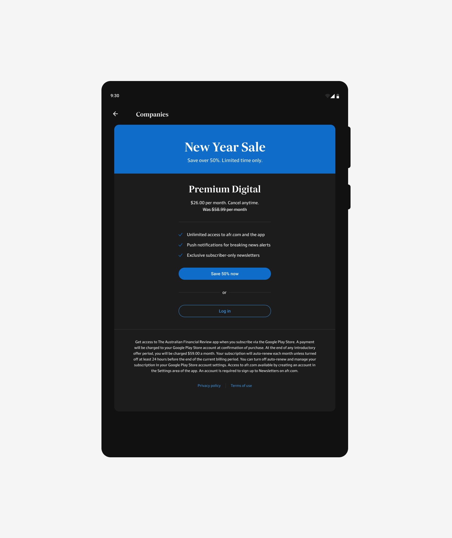
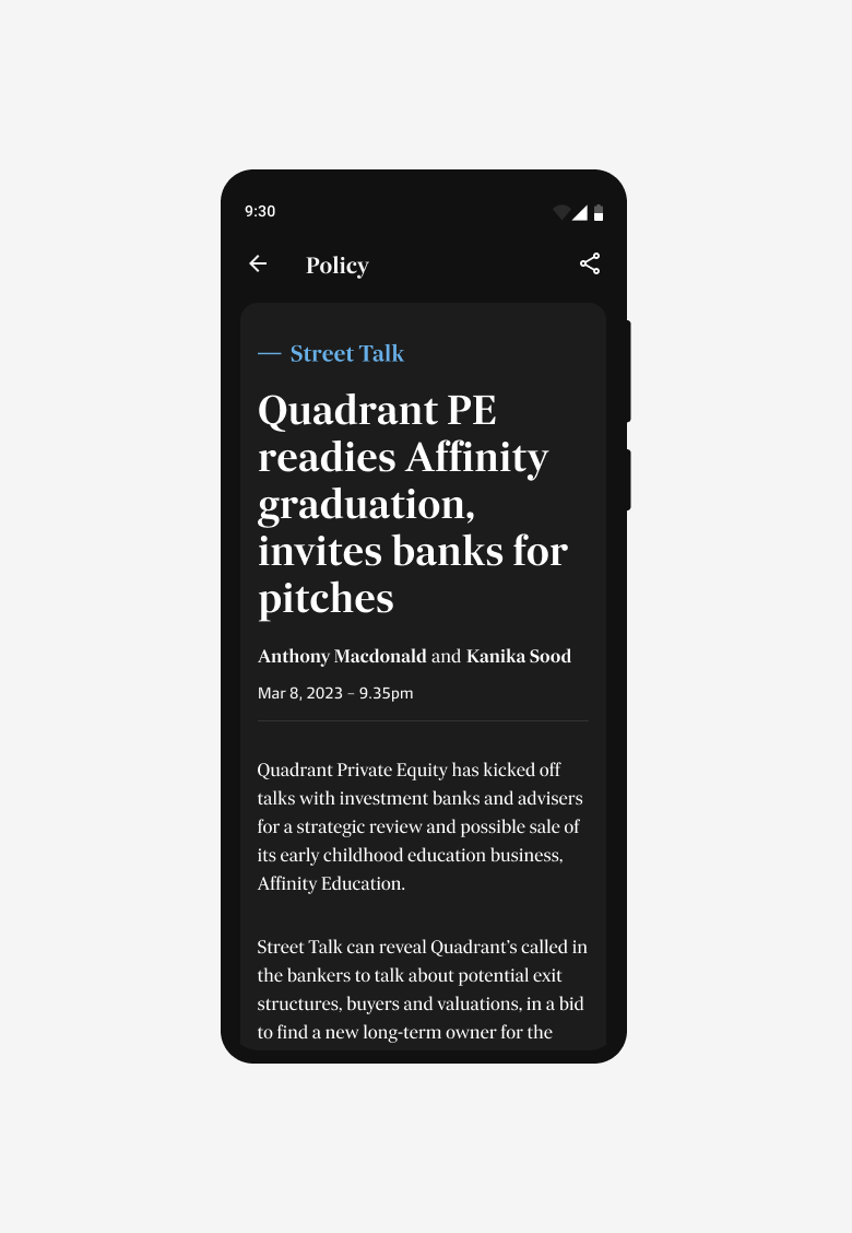
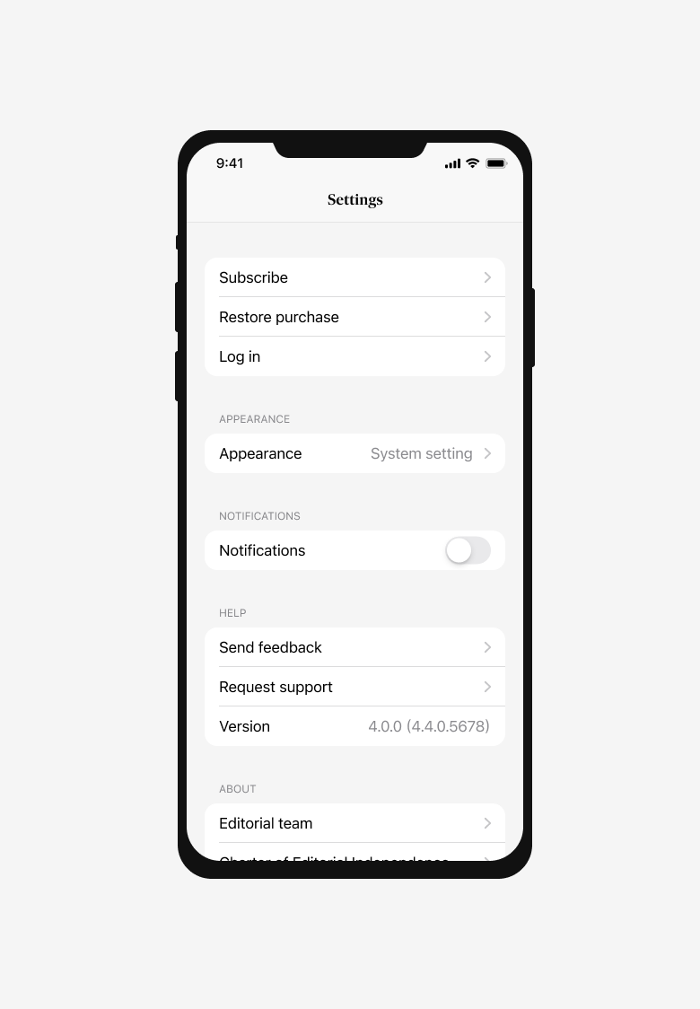
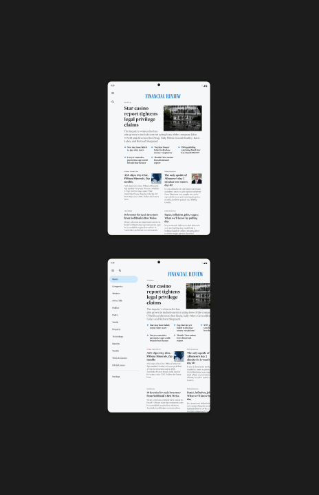
Being intentional with colour choices, maximising reading comfortability. Soft greys for light mode, a gentle nod to our newspapers, and a completely new palette optimised for dark mode.